How To Create Mobile Template For Blogger

By 2013, more people will use mobile phones than PCs to get online.Do you secure your blog future by making your blog mobile friendly.By making your blog mobile friendly it can drive lot of traffic to your blog.Blogger is providing only 7 template which you can't customize.In this post I will help you make your desktop website more mobile-friendly by creating fast loading mobile blogger templates.Just follow below steps to create mobile template for blogger.
Step 1
Go to http://www.howtogomo.com now scroll down and you will find picture says "Create Your Mobile Site Now" Just click on it.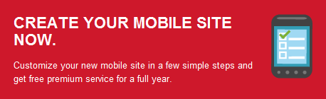
Step 2
Now you have to enter your blog URL,after entering your blog URL just click on "Make My Site Mobile" Button.
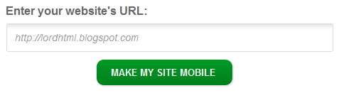
Note-By clicking "Make My Site Mobile," you are sending information to DudaMobile. See related Privacy Policy.
Step 3
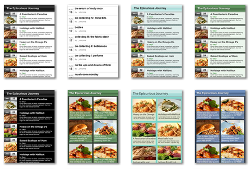
Now a pop out will appear asking you for selecting template type,I will prefer you to select Blog Template because it will provide you wide range of responsive templates.Now you need to chose blog template for your site there are total 13 template available for your blog select one of them and remember to test is before applying.
Step 4
Now after selecting proper template for your blog click on Next Button to proceed ahead.Now you will find many option to customize your mobile template according to you.
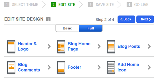
- Edit Header & Logo:After clicking on this option it will provide you tool by which you can change blogger background color you can also add image or text to header.You can also add Css to customize header.
- Blog Homepage:It will provide you tool by which you can change background color of homepage body.You can also change text font and size.
- Blog Posts:By clicking on it you can view the main post area of your blog.
- Blog Comments: If you don’t have an interactive commenting system your visitors will never leave a comment so this tool will allow you to customize your comment style. You can change color, add avatar and much more.
- Footer: As we all know Footer is the place where we give credits to the developer of the website so you can use it for that purpose. However, you can also use it to increase your width and height and much more.
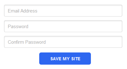
Step 5
Now after customizing you template you need to register free account and remember it will not take lot of time because you just need to enter your email and password.
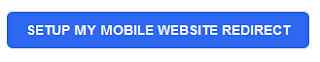
Step 6
Now you can see link just click on it and preview your mobile blog from different mobile OS.We need to setup your blog redirection for this you will see blue button with text "SETUP MY MOBILE WEBSITE REDIRECT".
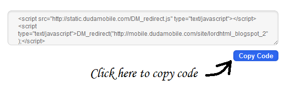
After clicking on above button you will see JavaScript code in text box just copy that code and paste it above </head> tag in your blog.
huh! Finally we completed all the steps now jus rush to your mobile devise and preview your mobile friendly blog there
0 comments:
Post a Comment